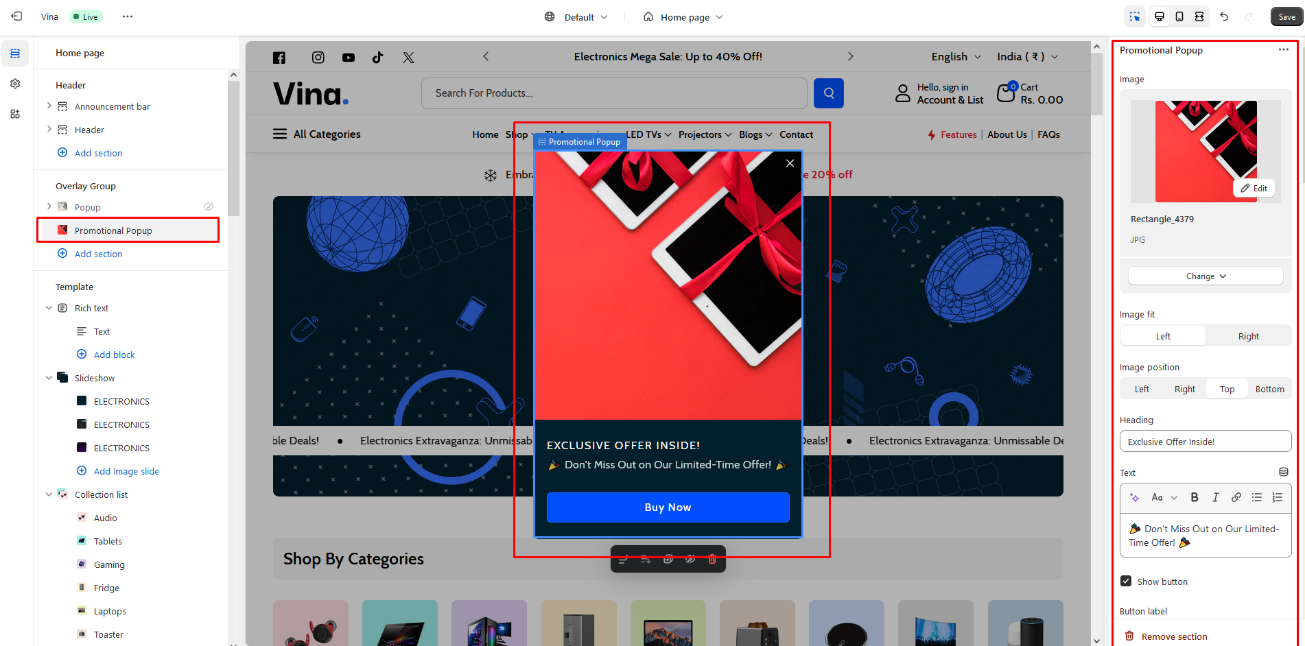
Promotional Popup
The Promotional Popup: Effortlessly create and customize popups to showcase special offers, discounts, or important announcements. Choose from various display triggers, such as time delay or user interactions, to effectively capture your visitors' attention. Make your messages pop with our promotional popup feature!
Recommendation Size Promotional popup image size: 260x214
Image
Use "Image" to add the image to the section.
Image fit
The image fit customization setting is as follows:
Contain
Cover
Image position
Following is the image position customization of the popup.
Left
Right
Top
Bottom
Heading
Enter text to display as a heading on the promotional popup section.
Text
Enter text to display as a description on the promotional popup section.
Show button
Enabling this checkbox will display the button.
Button label
Use "Button label" to add a label to the Button in the section.
Button action
Customization of the "Button action" in the promotional popup section is as follows:
Link
Accept
Button link
Use "Button link" to add a link to the Button in the section.
Button style
Customization of the "Button style" in the promotional popup section is as follows:
Primary
Secondary
Tertiary
Position
To change the position of the promotional popup, utilize the "Position" setting. Customization of the "Position" in the promotional popup section is as follows:
Top left
Top
Top right
Left
Center
Right
Bottom left
Bottom
Bottom right
Triggers
Id By adding an ID to any text, and specifying that id as '#yourId' in this setting, clicking on the text will trigger the opening of the promotional popup. In these settings, only when you choose 'manual trigger' in the 'Trigger open' settings will it function as expected. Trigger open
Customization of the "Trigger open" in the promotional popup section is as follows:
Time delay
Scroll position
Exit intent
Manual trigger
Time delay for a trigger open In these settings, you can define the timing for opening the popup. only when you choose 'Time delay' in the 'Trigger open' settings will it function as expected. Open scroll type By customizing these settings, you can specify the scroll type in either pixels or percentages. Customization of the "Open scroll type" in the promotional popup section is as follows:
Px
%
Open scroll position After scrolling a certain number of pixels or a specified percentage, you can add that numerical value here to determine when the popup should open CSS selector for manual trigger By adding an class to any text, and specifying that class as '.yourClass' in this setting, clicking on the text will trigger the opening of the popup. In these settings, only when you choose 'manual trigger' in the 'Trigger open' settings will it function as expected.
If the html element has buttons or links inside, then clicking on them will not work. Trigger close
Customization of the "Trigger close" in the promotional popup section is as follows:
Time delay
Scroll position
None
Time delay for a trigger close In these settings, you can define the timing for closing the popup. only when you choose 'Time delay' in the 'Trigger open' settings will it function as expected. Close scroll type
By customizing these settings, you can specify the scroll type in either pixels or percentages. Customization of the "Close scroll type" in the promotional popup section is as follows:
Px
%
Close scroll position After scrolling a certain number of pixels or a specified percentage, you can add that numerical value here to determine when the popup should close. Show close button Enabling this checkbox will display the close button in the promotional popup section.
Style
Width Use this option to increase or decrease the popup width. You can set a minimum of “200px” and a maximum of “1920px”. Open animation
Customization of the "Open animation" in the promotional popup section is as follows:
Fade
Slide
Zoom
Slide and fade
Close animation
Customization of the "Close animation" in the promotional popup section is as follows:
Fade
Slide
Zoom
Slide and fade
Show overlay When this checkbox is enabled, the overlay will be displayed when the popup is triggered.
Advanced
Mobile disable When 'Mobile disable' is enabled, the popup will be disable on mobile. Disable scrolling When 'Disable scrolling' is activated, it will disable scrolling on the body of the page. Click overlay to close Enabling this option will cause popup to close when user clicks on overlay. Press ESC to close Checking this will cause popup to close when user presses ESC key. Press F4 to close Enabling this option will cause popup to close when user presses F4 key. Show on homepage By checking this checkbox, the popup will only be displayed on the homepage. Show on product and category By enabling this checkbox, the popup will only be displayed on the product and category page. Show on all pages Enabling this checkbox will display the popup on all pages except for the customer page.
Color scheme
In this section, you can change the background and foreground color of a section using the color scheme.
Scheme 1
Scheme 2
Scheme 3
Scheme 4
Scheme 5

Last updated