Newsletter Popup
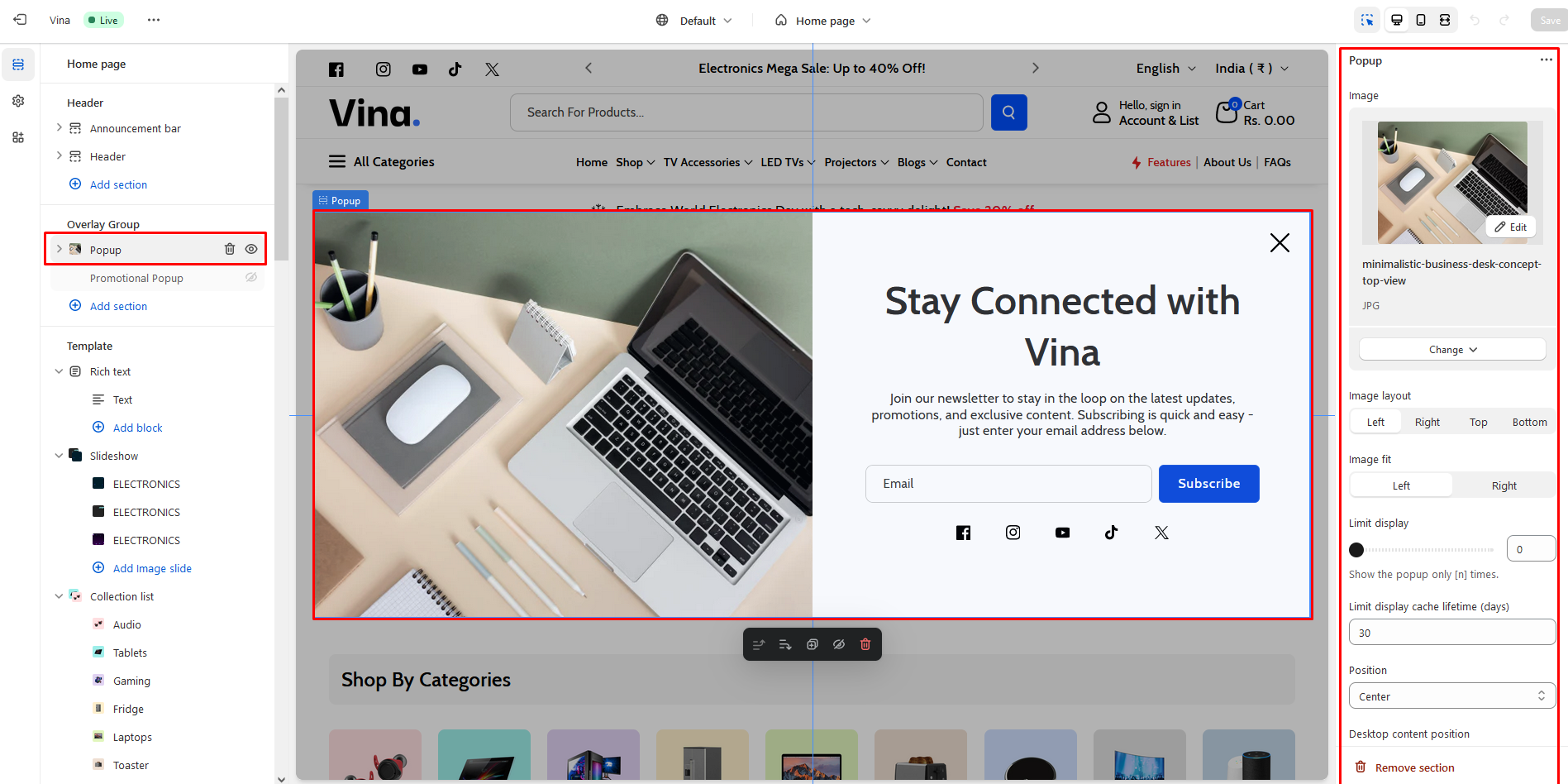
A subscription popup is a user-friendly feature in your theme documentation that allows visitors to subscribe to updates, news, and important information related to your theme. This non-intrusive form typically appears as a small window or overlay, enabling users to easily input their email addresses and opt-in to receive notifications. Customization options are available to match the popup's appearance to your theme's design.
Recommendation Size Newsletter popup image size: 390x400
Image
Use "Image" to add the image to the section.
Image layout
Following is the image layout customization of the popup.
Left
Right
Top
Bottom
Image fit
The image fit customization setting is as follows:
Contain
Cover
Limit display
You can adjust the limit for displaying the popup using the 'Limit display' setting. You can show the popup a minimum of 0 and a maximum of 100 times.
Limit display сache lifetime (days)
You can specify the number of days for which the popup will be displayed. Enter the desired number of days here.
Position
To change the position of the popup, utilize the "Position" setting. Customization of the "Position" in the popup section is as follows:
Top left
Top
Top right
Left
Center
Right
Bottom left
Bottom
Bottom right
Desktop content position
To change the position of the content on the popup, utilize the "Desktop content position" setting. Customization of the "Desktop content position" in the popup section is as follows:
Left
Center
Right
Triggers
Id By adding an ID to any text, and specifying that id as '#yourId' in this setting, clicking on the text will trigger the opening of the popup. In these settings, only when you choose 'manual trigger' in the 'Trigger open' settings will it function as expected. Trigger open
Customization of the "Trigger open" in the popup section is as follows:
Time delay
Scroll position
Exit intent
Manual trigger
Time delay for a trigger open In these settings, you can define the timing for opening the popup. only when you choose 'Time delay' in the 'Trigger open' settings will it function as expected. Open scroll type By customizing these settings, you can specify the scroll type in either pixels or percentages. Customization of the "Open scroll type" in the popup section is as follows:
Px
%
Open scroll position After scrolling a certain number of pixels or a specified percentage, you can add that numerical value here to determine when the popup should open CSS selector for manual trigger By adding an class to any text, and specifying that class as '.yourClass' in this setting, clicking on the text will trigger the opening of the popup. In these settings, only when you choose 'manual trigger' in the 'Trigger open' settings will it function as expected.
If the html element has buttons or links inside, then clicking on them will not work. Trigger close
Customization of the "Trigger close" in the popup section is as follows:
Time delay
Scroll position
None
Time delay for a trigger close In these settings, you can define the timing for closing the popup. only when you choose 'Time delay' in the 'Trigger open' settings will it function as expected. Close scroll type
By customizing these settings, you can specify the scroll type in either pixels or percentages. Customization of the "Close scroll type" in the popup section is as follows:
Px
%
Close scroll position After scrolling a certain number of pixels or a specified percentage, you can add that numerical value here to determine when the popup should close.
Style
Width Use this option to increase or decrease the popup width. You can set a minimum of “200px” and a maximum of “1920px”. Open animation
Customization of the "Open animation" in the popup section is as follows:
Fade
Slide
Zoom
Slide and fade
Close animation
Customization of the "Close animation" in the popup section is as follows:
Fade
Slide
Zoom
Slide and fade
Show overlay When this checkbox is enabled, the overlay will be displayed when the popup is triggered.
Advanced
Mobile disable When 'Mobile disable' is enabled, the popup will be disable on mobile. Disable scrolling When 'Disable scrolling' is activated, it will disable scrolling on the body of the page. Click overlay to close Enabling this option will cause popup to close when user clicks on overlay. Press ESC to close Checking this will cause popup to close when user presses ESC key. Press F4 to close Enabling this option will cause popup to close when user presses F4 key. Show on homepage By checking this checkbox, the popup will only be displayed on the homepage. Show on product and category By enabling this checkbox, the popup will only be displayed on the product and category page. Show on all pages Enabling this checkbox will display the popup on all pages except for the customer page.
Color scheme
In this section, you can change the background and foreground color of a section using the color scheme.
Scheme 1
Scheme 2
Scheme 3
Scheme 4
Scheme 5

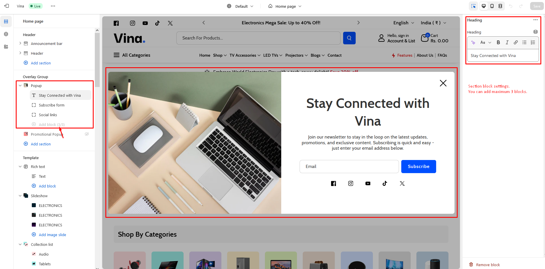
Add block
To add block to the Popup section, click on the 'Add block'. There are many options available , as you can see in the below points and screenshot.
Heading
Heading Enter text to display as a title on the popup section.
Subscribe form
Click on the "Add block" and select the Button.
Placeholder input Enter text to display as a placeholder input on the popup section. Button label Use "Button label" to add a label to the Button in the section. Button style
Customization of the "Button style" in the popup section is as follows:
Primary
Secondary
Tertiary
Button position column Enabling this checkbox will display the button position in column.
Description Enter text to display as a description on the popup section.
Social links
Icon color Using this setting, you can change the icon color - By checking the checkbox below, you can display the social icons.

Last updated